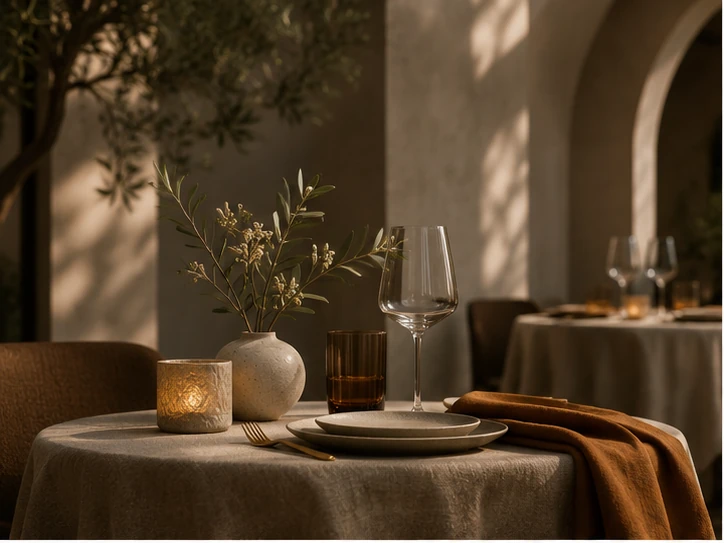
BOTANICAL · QUIET LUXURY
Plant-led boutiques
Great for florals, interior objects, calm lifestyle products and carefully styled small collections.
Thoughtfully designed online shops for brands, makers and businesses who want the buying experience to feel as distinctive as the products themselves.
Editorial product photography, quiet luxury, and enough flexibility to make every item feel considered — not simply uploaded.
An example of a refined product page direction, pairing atmosphere with clarity so the product feels premium and easy to buy.
Different products deserve different visual languages. Explore four storefront directions — all built on the same calm, editorial design system.
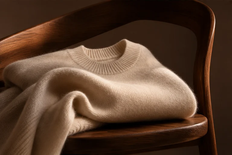
A good online shop does more than display products. It creates trust, carries the atmosphere of your brand and makes the buying journey feel intuitive.
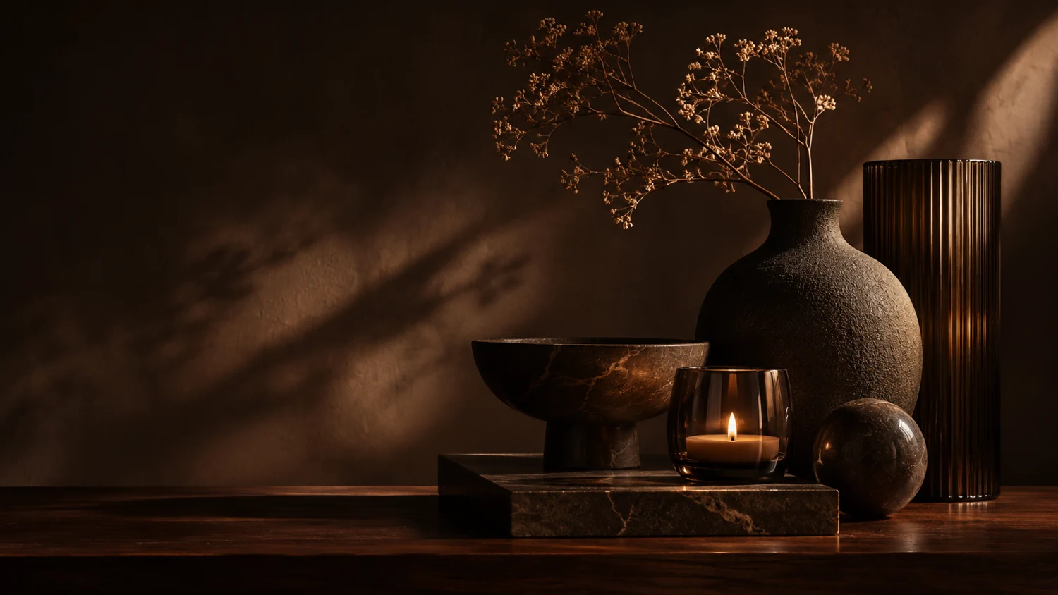
Large product visuals, room for storytelling, and a purchase area that feels refined rather than purely technical. This is how a store becomes part of the brand.
Visual hierarchy gives the product room to breathe, while supportive text helps people understand what makes it special.
Thoughtfully presented feedback helps your shop feel trustworthy without overwhelming the product page.
Clear options, quantities and related products — presented cleanly and without clutter.
Campaign blocks, gift guides and featured collections make it easier to guide attention where it matters.
You should be able to edit products, organise collections and keep your shop current without turning every small change into a technical project.
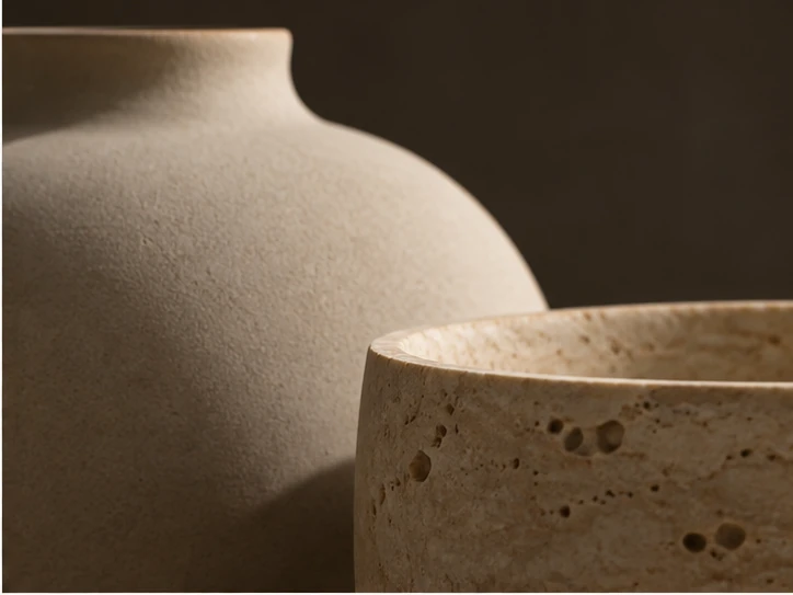
Manage prices, descriptions, product types and variants in a straightforward structure designed for day-to-day use.
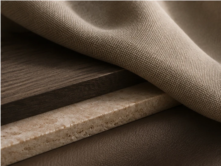
From home page highlights to product detail pages, the structure remains calm and easy to maintain.

Order overviews, shipping states and payment confirmations should be readable and easy to navigate.
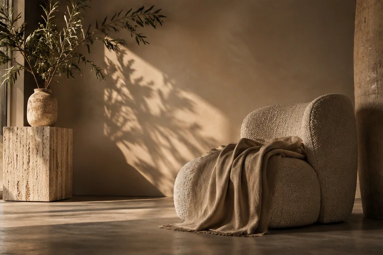
Show offers, small banners and collection promotions without ruining the elegance of the design.
Your online shop should fit into the wider way you work — from payments and fulfilment to newsletters, forms and external platforms.
The exact ecosystem always depends on the shop, but there is room to think beyond the storefront itself.
Payment options, taxes, custom pricing and customer-friendly ordering all play a role in whether your shop simply exists — or actually sells.
A cleaner checkout, clear tax information and well-placed trust signals can make a meaningful difference. The practical part of the shop should still feel elegant.
Clear tax configuration and region-aware details make the final price less ambiguous.
Offer payment methods that match what your customers actually expect to use.
Surface shipping notes and timelines where people need them, not buried later.
Handle special requests, personalisation or made-to-order logic more gracefully.
Whether it is a personalised object, a made-to-order item or a small service add-on, the structure can be built around how you actually sell.
Independent makers, boutique product brands, design objects, florals, beauty and more — the page structure can adapt to the reality of your offer.
One design language does not have to mean one kind of shop. The system can flex depending on what you sell and how you want to present it.
For small collections, premium products and slower-commerce brands that need atmosphere, trust and careful visual hierarchy.
Ideal when the product itself is tied to craft, story and a sense of authorship — from objects to prints, florals or limited editions.
For businesses selling both products and appointments, workshops, bookings or supporting digital resources.
The page can also make room for more commercial actions — from campaigns and gift edits to email capture, feature sections and seasonal storytelling.
Create moments for people to browse collections through a curated point of view rather than a flat catalogue.
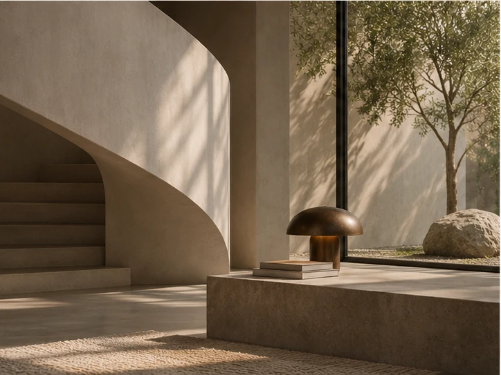
Use short stories, routines or behind-the-brand details to strengthen desire without overcomplicating the page.

Bring attention to new arrivals, bundles or curated selections while preserving a calmer visual experience.
A good online shop balances brand feeling with clarity. It should look trustworthy, reflect the value of the products and make browsing, understanding and buying feel easy.
Yes. Even when a site is built with practical tools, the way the imagery, hierarchy, tone, product pages and campaign sections come together can create a very distinct presence.
Physical products, small collections, custom products, artist editions, boutique beauty, florals, interiors and many hybrid offers that mix products with services or bookings.
That depends on the platform and the exact workflow, but a shop can usually be structured to work smoothly with the practical tools your business depends on.
Yes. A good system leaves room for future collections, campaigns, product categories and content additions without forcing a complete redesign immediately.
Clarity around structure, recommendations and practical questions so the project feels easier to move forward with.
Useful if you want to define what the shop needs before moving into a full design and build stage.
If you want a shop that feels considered, usable and genuinely aligned with your brand, we can shape a concept that does justice to what you sell.
An ending section can still continue the story: one more refined product view, one last invitation, and a consistent atmosphere right through to the footer.